top of page


The Cove
A streamlined mobile ordering app catered towards efficient and effective ordering for customers of the renowned Lakeside Bistro.
My Role
Sole UX Designer
Duration
October - December 2022
Design Software
Figma
Overview
The Cove mobile ordering app was my first project in the Google UX Design Professional Certificate Program. I chose to design an app for The Cove because I had immediate access to interview customers for research. As The Cove has increased in popularity throughout the years, their customers have expressed a need for a way to efficiently order their favorite meals for pickup. In response, I designed an app for lovers of The Cove, as well as new customers who seek to enjoy their renowned dishes from the comfort of their own homes.
The Problem
The Cove’s customers lack the necessary time to prepare meals and dine in at the restaurant. They need a quick and easy way to enjoy their favorite meals from home.
The Goal
Design a mobile ordering app for The Cove that allows users to efficiently order and pick-up their favorite meals. In order to meet this goal, I followed the design process shown below.

The Design Process
Empathize
Define
Ideate
Prototype
Test
Empathize
The first step I took was empathizing with users. My goal during the empathize phase was to learn more about users and gain insights on their desires, needs and problems. During the empathize phase, I conducted interviews, identified user pain points, created personas, and made a user journey map. These research findings informed my decision-making in later design phases.
Interviews
-
In order to make the most out of my interviews, I determined clear research goals:
-
I want to identify clear pain points in the participant's current ordering experience and how my app will effectively address them.
-
I want to understand user needs and frustrations as they relate to the app I’m designing.
-
I want to uncover specific features participants find important in the mobile-ordering process and why.
-
Keeping the goals of my research in mind, I wrote interview questions and gathered 5 participants that met the study’s desired characteristics. A few characteristics included participants between the ages of 18 and 65 with diverse backgrounds & abilities, access to a mobile device, and order take-out at least once a week. Displayed on the right are a few interview highlights.

5 out of 5 participants use an app to order food when looking for a quick and easy way to quench their hunger.
3 out of 5 participants would like an option to view the menu's nutrition information.
5 out of 5 participants reported they would use a mobile ordering app for their favorite restaurant.
4 out of 5 participants prefer to order food for pickup rather than dining in.
1 out of 5 participants had a good experience ordering from The Cove through a third-party pickup service.
Pain Points
Feedback from participants revealed four important user pain points.

Time
Financial
Process
Accessibility
Working adults and students do not have time to prepare meals or sit down at restaurants.
Users are frustrated with hidden fees involved with ordering food through third-party pickup services.
Users are annoyed with how overwhelming the mobile ordering process is in most apps.
Existing mobile ordering platforms are not compatible with assistive technologies.
Personas
Based on common themes and pain points found in data, I created user personas. Daniel and Anna's goals, motivations, and frustrations represent the needs of a majority of users.

.png)
User Journey Map
Building off of user personas, I made a journey map to highlight new pain points and identify improvement opportunities. Mapping the current user journey revealed how helpful it would be for users to have a dedicated mobile ordering app for The Cove.
.png)
Define
In the define phase, I analyzed my research findings and determined the most important user problems to solve to define a clear goal for the design of the app. During the define phase, I created a clear problem statement, hypothesis statement, and value propositions.
Problem Statement
Building on one of the personas created in the empathize phase, I made a problem statement that is focused on the users' needs, broad enough for creative freedom, and narrow enough to be solved by a practical design solution:
Problem statement: Anna is a full-time nurse with a demanding schedule who needs a quick and easy way to enjoy her favorite meal from The Cove because she does not have time to prepare dinner.
Hypothesis Statement
Building on the problem statement, I made a corresponding hypothesis statement that states a specific action followed by my solution that meets the user’s needs and addresses pain points:
Hypothesis Statement: If Anna uses The Cove mobile ordering app to place a pickup order, then she will be able to efficiently pickup and enjoy her favorite meal for dinner.
Value Propositions
Creating value propositions highlighted key features I needed to include in my app design to address the users' needs. I described my app’s benefits and features and organized them into the four qualities of a great user experience: usable, equitable, enjoyable, and useful.

Ideate
In the ideation phase, I explored design solutions to the problems identified in the define phase. After exploring various solutions, I decided which to pursue for prototypes. During the ideation phase, I conducted a competitive audit, brainstormed with crazy eights, outlined the user flow, and created low-fidelity wireframes & prototypes.
Competitive Audit
I conducted a competitive audit to explore my competitor’s strengths and weaknesses and give myself a foundation of knowledge on the market my app was entering. Below is the general information of the competitive audit, you can view the full version here.

Crazy Eights
In order to generate ideas quickly, I used the Crazy Eights design ideation exercise I learned from the Google UX Design Professional Certificate. This exercise was a fun, creative way to generate lots of unique solutions.

User Flow
After generating ideas, I outlined the user flow to gain a clear understanding of how users could effectively navigate through the app before beginning the initial designs.
.jpg)
Low-Fidelity Wireframes
After creating the user flow, I drew low fidelity wireframes. I first wrote down a list of elements I needed for each screen, then created 4 different versions for each one. After drawing 4 versions of each screen, I put a star next to my favorite elements to narrow down which ones I’d include in the final version. I then combined these elements into refined wireframes and built them digitally using Figma.


Low-Fidelity Prototypes
Once my digital low-fidelity wireframes were complete, I created low-fidelity prototypes.

Prototype & Test
In the prototyping and testing phases, I went through multiple tests and iterations in order to finalize my design. During these phases, I conducted the first usability study, iterated on my low-fidelity designs, transitioned into mockups and high-fidelity prototypes, conducted a second usability study, and iterated on mockups.
First Usability Study
After my low-fidelity prototypes were complete, I planned the first usability study. I ensured 7 key elements were included in my research plan: the project background, research goals, research questions, KPI’s, methodology, participants, and a script. I recorded participants' click paths, notable observations, quotes, and rated their task completion. You can view my research plan here. I then conducted a moderated usability study with 5 participants. Below are results from one participant, you can view all 5 here.

Insights
-
Following the first usability study, I organized my data using an affinity diagram.

-
Based on common themes throughout the usability study, I found three actionable insights:

Users need a larger back button for smooth navigation between screens.
Users need a simplified checkout screen.
Users need a more intuitive way to complete the payment process.
Low-Fidelity Iterations
-
Based on the first insight, I created a larger and usable back button for all screens.
-
Based on the second insight, I redesigned a simplified checkout screen with text that is readable for all users. I also placed the pickup date and time information earlier in the user flow.
-
Based on the third insight, I redesigned the payment screen to ensure the process is smooth for users.
Before Iterations

After Iterations

Mockups & High-Fidelity Prototypes
After refining my designs, I built mockups. I also created a style guide to maintain consistency throughout my app.

The Cove's Style Guide

Second Usability Study
After creating mockups and high-fidelity prototypes, I conducted a second usability study to understand how users would interact with the final design and iterate on any areas that needed improvement. I added additional questions to my research plan and enhanced my script to gather stronger data. You can view my updated research plan here. I then conducted a second usability study with 5 new participants. Below are results from one participant, you can view all 5 here.

More Insights
Following the second usability study, I found two actionable insights drawn from common themes:

Users need an accent color with a higher contrast.
Returning users need a more efficient checkout process.
High-Fidelity Iterations
-
Based on the first insight, I chose a darker accent color that passed the WCAG Color Contrast Checking System, WAVE.
-
Based on the second insight, I added a “Use my Profile Information” button that allows returning users to skip filling in unnecessary information.
Before Iterations
After Iterations

Before Iterations
After Iterations

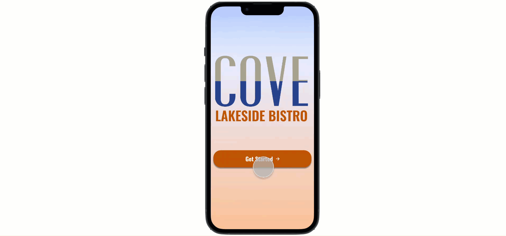
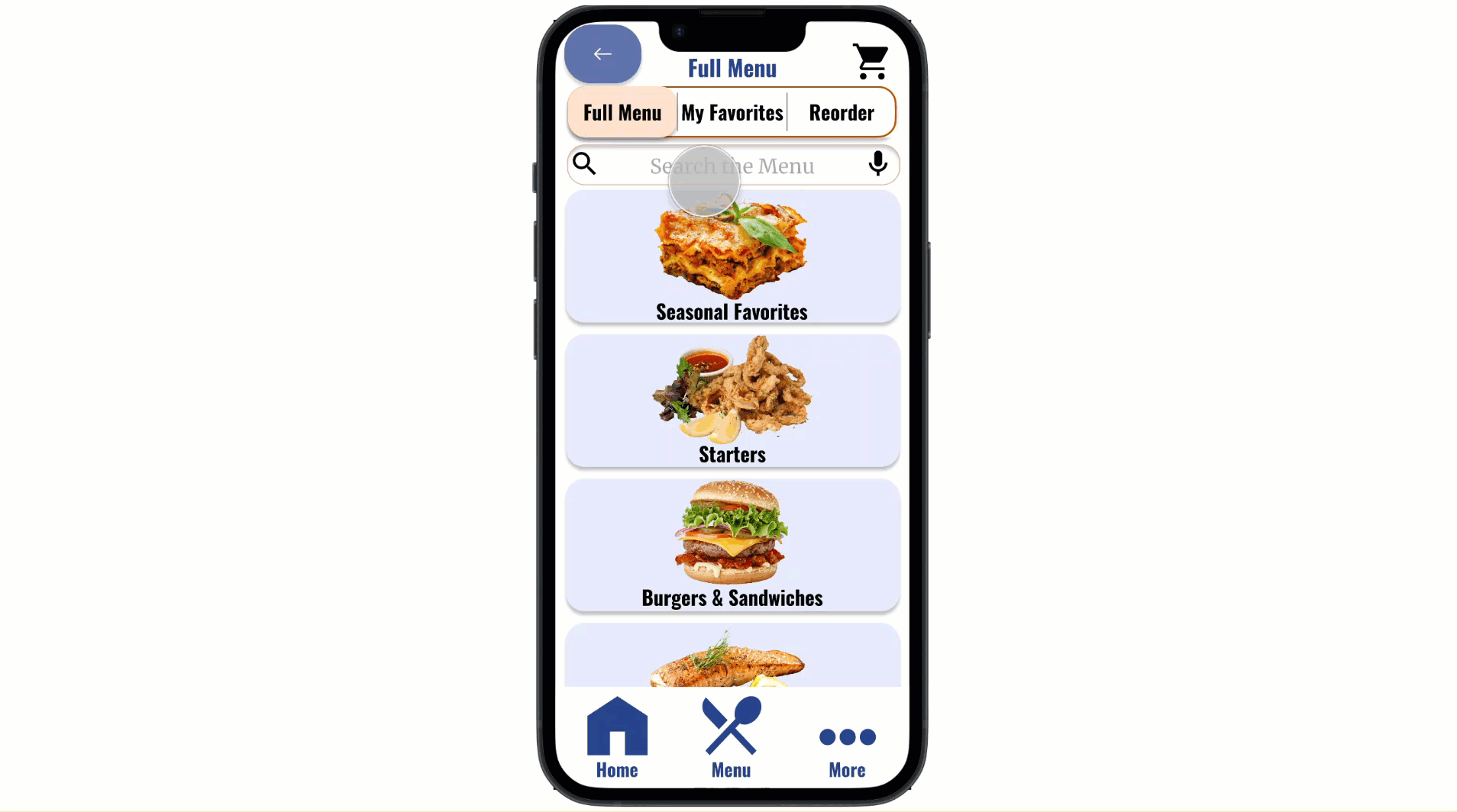
The Final Design
After ensuring my design was usable, equitable, enjoyable, useful, and fulfilled the intended user experience, I decided it was finished. See the final user flow and key features below.
User Flow
Smooth onboarding process for new and returning users.
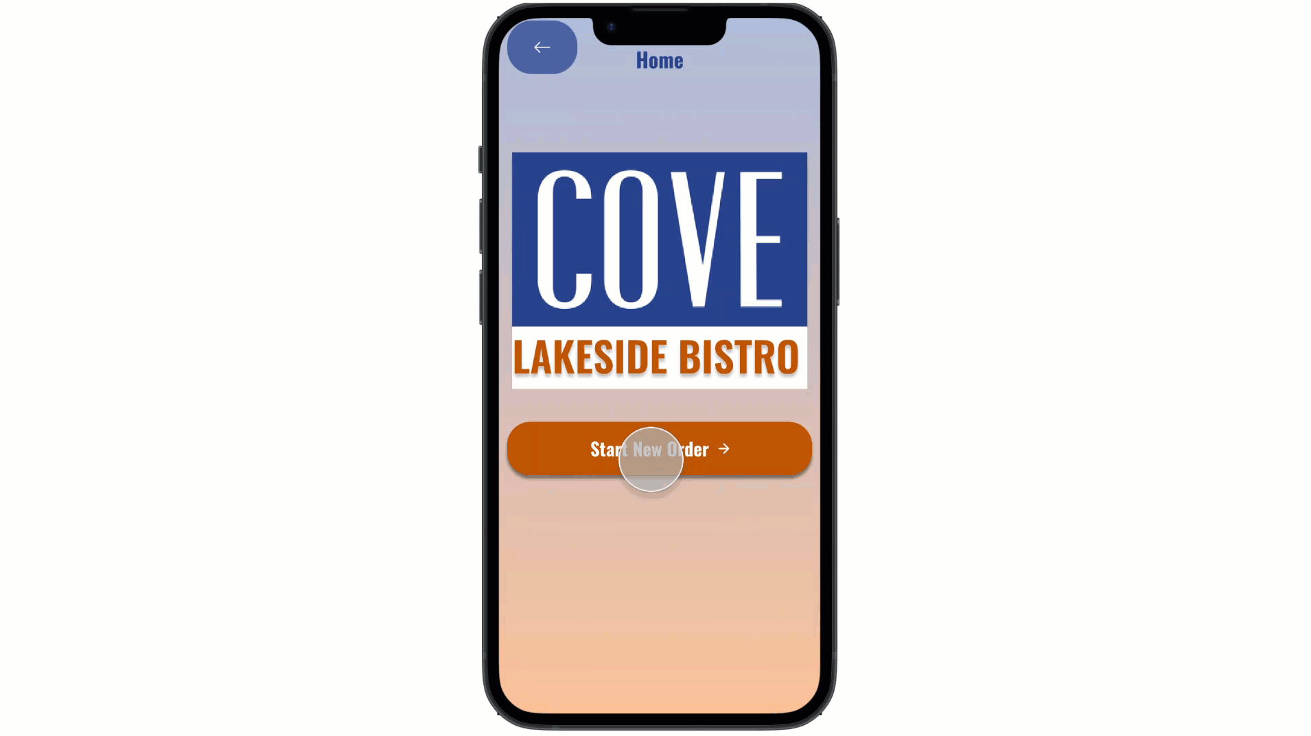
Fast and efficient ordering process.
Convenient features for returning users.
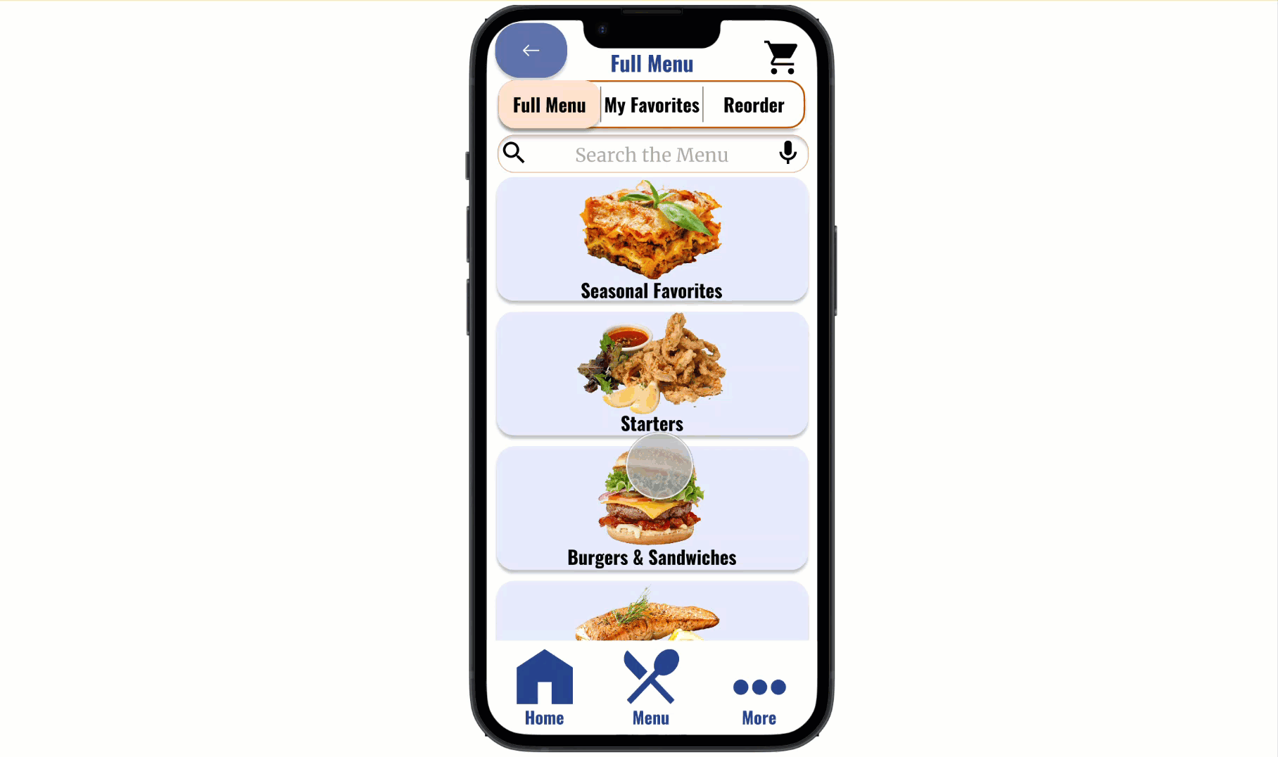
Large array of food options with beautiful images and nutrition information.
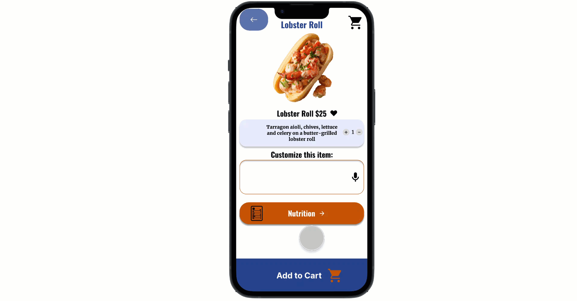
Quick and seamless checkout process.
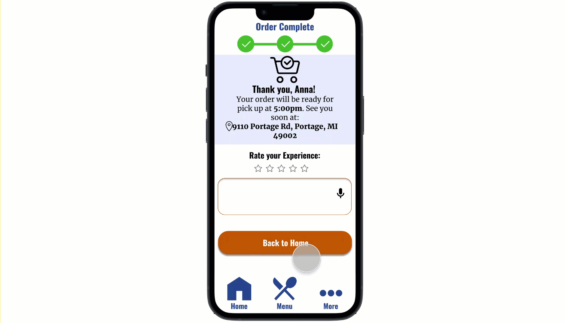
Useful categories for additional information.
Reflection
What I Learned
The Cove mobile ordering app was my first UX Design project, so I definitely learned A LOT along the way. When I first started the project, I remember being super excited but a bit nervous on executing the foundational skills I had just learned. It has been so encouraging seeing my confidence grow as a designer, I now feel comfortable applying all of my skills and look forward to continuing to build them. One of the most important things I learned from this project is that iteration is key, especially early on! In addition, I also learned that feedback is your best friend in UX design. I am so grateful for all of the feedback I have received from peers, and especially my mentor.
Next Steps
-
Translation Feature: Something I really wanted to incorporate in my app was a translation feature to support users of all languages. I didn’t include it in this design because in order to translate the app I’ll need to learn a new coding language (which I’m planning on doing in the future). Luckily, I kept localization in mind while designing my app by reserving enough space for longer text, choosing fonts that work for all languages, frequently utilizing icons, and using large buttons that support the text length of multiple languages.
-
More Testing: While I did gain a great amount of valuable feedback in the two usability studies I conducted; I feel that there is always room for improvement. I would love to eventually conduct a third usability study to validate whether the pain points users experienced have been effectively addressed.
bottom of page