top of page


A sustainable living app designed to help users take action against climate change, adopt effective green habits, and share their experience with friends.
My Role
Sole UX Designer
Duration
December 2022 - January 2023
Design Software
Figma
Overview
Go Green was my third project in the Google UX Design Professional Certificate Program. I chose to create an app focused on sustainability because I wanted to use my skills to drive positive change through design. As someone who is passionate about protecting our Earth, I recognize how overwhelming it is to find practical ways to take action. In response, I designed a sustainable living app that helps people take positive action against climate change, adopt effective green habits, and share their experience with friends.
The Problem
People are eager to take action against climate change but aren't sure how. They need a practical and affordable way to incorporate sustainable habits into their day-to-day lives.
The Goal
Design a sustainable living app that encourages people to take action against climate change by adopting practical and affordable green habits. In order to meet this goal, I followed the design process shown below.
The Design Process

Empathize
Define
Ideate
Prototype
Test
Empathize
Empathize
The first step I took was empathizing with users. My goal during the empathize phase was to learn more about users and gain insights on their needs, desires and problems. During the empathize phase, I conducted interviews, identified user pain points, created an aggregated empathy map, developed user personas, and made a user journey map. These research findings informed my decision-making in later design phases.
Interviews
-
In order to collect valuable feedback from my interviews, I first determined clear research goals:
-
I want to understand the current user experience of how people find information on practicing sustainability.
-
I want to identify clear pain points in the current user experience and how my app will effectively address them.
-
I want to uncover what specific information/features participants want included in my app and why.
-
Keeping the goals of my research in mind, I then wrote interview questions and gathered 5 participants that met the study’s desired characteristics. A few of these characteristics included participants who are open to practicing sustainability, have access to a mobile device, and are between the ages of 18 and 65 with diverse backgrounds & abilities. Displayed to the right are interview highlights.

"Adding tips on how to practice sustainability in day-to-day tasks would be helpful."
"I think including a rewards system would hold people accountable."
"I know how important practicing sustainability is but I'm not really sure how to."
"I'll usually look for tips or hacks on Google and Tiktok."
"I hear about it (sustainability) in class but not much about what I can actually do."
Pain Points
From the feedback gathered in interviews, I identified three important user pain points.

Time
Financial
Access
Users feel they do not have access to certain materials or products to practice sustainiblity.
Users are annoyed by the amount of time it takes to find practical sustainability tips on the internet.
Users are frustrated by the cost of sustainable living.
Aggregated Empathy Map
After identifying pain points, I categorized feedback into an aggregated empathy map. I used this method to synthesize themes seen throughout the interviews and create a shared understanding of users' needs.

Personas
Based on the common themes and pain points found in my data, I created user personas. Paul and Sally's goals, motivations, and frustrations represent the needs of a majority of users.


User Journey Map
Building off of user personas, I made a journey map to highlight new pain points and identify improvement opportunities. Mapping the current user journey revealed how helpful it would be for users to have a sustainable living app.

Define
In the define phase, I analyzed my research findings and determined the most important user needs, desires and problems to define a clear goal for the design of the website. During the define phase, I created a clear problem statement, hypothesis statement, and value propositions.
Problem Statement
Building on one of the personas created in the empathize phase, I made a problem statement that is focused on the users' needs, broad enough for creative freedom, and narrow enough to be solved by a practical design solution:
Problem statement: Paul is a college student who wants to incorporate sustainable habits into his life that are practical and affordable, but he is not sure where to start.
Hypothesis Statement
Building on the problem statement, I made a corresponding hypothesis statement that states a specific action followed by my solution that meets the user’s needs and addresses pain points:
Hypothesis Statement: If Paul uses the Go Green Sustainability App, he will find several practical and affordable ways to live sustainably and reminders that hold him accountable as he transforms his habits into a lifestyle!
Value Propositions
I created value propositions to highlight key features I needed to include in my website design to address the users' needs. I described my website’s benefits and features and organized them into the four qualities of a great user experience: usable, equitable, enjoyable, and useful.
.jpg)
Ideate
In the ideation phase, I explored design solutions to the problems identified in the define phase. After exploring various solutions, I decided which to pursue for prototypes. During the ideation phase, I conducted a competitive audit, brainstormed with crazy eights, outlined the user flow, and created low-fidelity wireframes & prototypes.
Competitive Audit
I conducted a competitive audit to learn about my competitor’s strengths and weaknesses and give myself a foundation of knowledge on the market my app was entering. Below is the general information of the competitive audit, you can view the full version here.

Crazy Eights
In order to get ideas flowing, I used the Crazy Eights design ideation exercise I learned from the Google UX Design Professional Certificate. This exercise was a great way to generate lots of unique solutions.

User Flow
After generating ideas, I outlined the app's user flow to gain a clear understanding of how users could effectively navigate through the app before beginning the initial designs.
.jpg)
Low-Fidelity Wireframes
After creating the user flow, I drew low fidelity wireframes. I first wrote down a list of elements I needed for each screen, then created 4 different versions for each one. After drawing 4 versions of each screen, I put a star next to my favorite elements to narrow down which ones I’d include in the final version. I then combined these elements into refined wireframes and built them digitally using Figma.


Low-Fidelity Prototypes
Once my low-fidelity wireframes were completed, I created low-fidelity prototypes.

Prototype & Test
In the prototyping and testing phases, I went through multiple tests and iterations in order to finalize my design. During these phases, I conducted the first usability study, iterated on my low-fidelity designs, transitioned into mockups and high-fidelity prototypes, conducted a second usability study, and iterated on mockups.
First Usability Study
After my low-fidelity prototypes were complete, I conducted the first usability study. I ensured 7 key elements were included in my research plan: the project background, research goals, research questions, KPI’s, methodology, participants, and a script. I recorded participants' click paths, notable observations, quotes, and rated their task completion. You can view my research plan here. I then conducted a moderated usability study with 5 participants. Below are results from one participant, you can view all 5 here.

Insights
-
Following the first usability study, I organized my data using an affinity diagram.
.jpg)
-
Based on common themes throughout the usability study, I found three actionable insights:

Users need an improved navigation bar that emphasizes the action page.
Users need a more intuitive task completion screen.
Users need large and usable task buttons.
Low-Fidelity Iterations
-
Based on the first insight, I added text to the navigation bar and enlarged the "Take Action" button.
-
Based on the second insight, I created larger buttons and prototyped the task box so users can easily navigate to the task screen by tapping either.
-
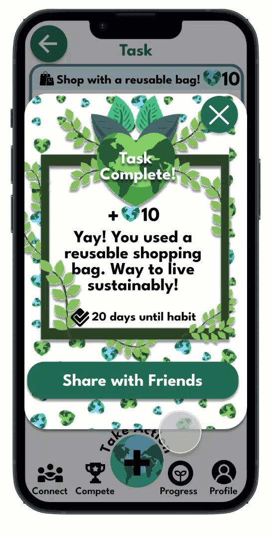
Based on the third insight, I turned the task completion screen into an overlay with options to share with friends.
Before Iterations
Task button is too small and unusable.
Confusing navigation bar with unclear icons.

After Iterations

Large, usable task button and interactive photo.
Added descriptions for easy navigation.
Before Iterations
Misleading task completion screen with no direction.

After Iterations

Convenient overlay that allows sharing with friends!
Mockups & High-Fidelity Prototypes
After refining my low-fidelity designs, I transitioned to mockups and high-fidelity prototypes. I also created a style guide to maintain consistency throughout my design.

The Go Green Style Guide

Second Usability Study
After creating mockups and high-fidelity prototypes, I conducted a second usability study. I added additional questions to my research plan and wrote a more thorough script to gather stronger data. You can view my updated research plan here. I then conducted the usability study with 5 new participants. Below are results from one participant, you can view all 5 here.

System Usability Scale
Following the second usability study, I sent a modified system usability scale survey to all 10 participants from both sessions.


More Insights
Following the second usability study, I found two actionable insights drawn from common themes:

Users need a clear set of instructions displayed in the onboarding process.
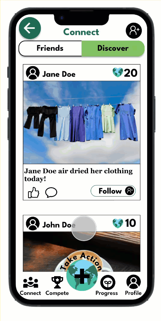
Users need the ability to edit and add captions to their posts.
High-Fidelity Iterations
-
Based on the first insight, I added a welcome screen with important instructions that appears after users create an account. Users also have the option to skip it.
-
Based on the second insight, I added a text box for users to caption their posts.
Before Iterations
No clear instructions for users to learn how to use the app

After Iterations

Clear instructions stated after creating an account for a seamless user experience
Before Iterations
No option for users to add and edit their own captions

After Iterations

A text box for users to add and edit their ow captions
The Final Design
After ensuring my design was usable, equitable, enjoyable, useful, and fulfilled the intended user experience, I decided it was finished. See the user flow and key features below.
User Flow

Smooth onboarding process with clear navigation instructions.
A daily sustainable task along with several choices for users to save and complete later.
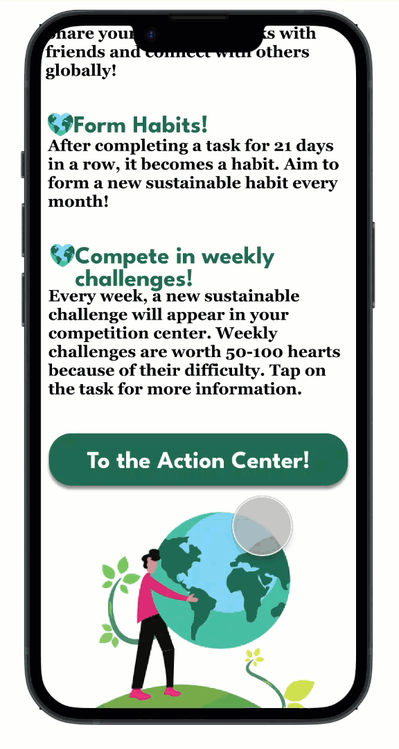
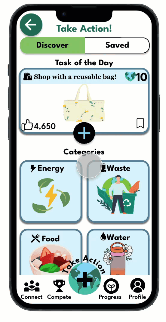
Informative and engaging tasks with enjoyable graphics.
Connect feature that allows users to share their progress with friends.
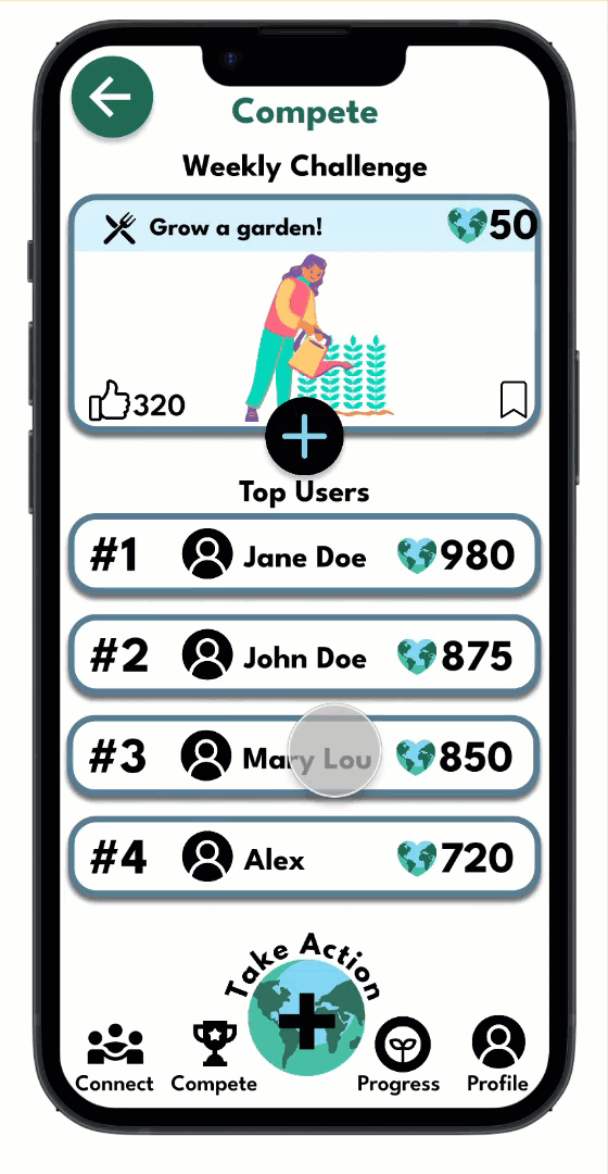
Competition feature that includes a new challenge every week.
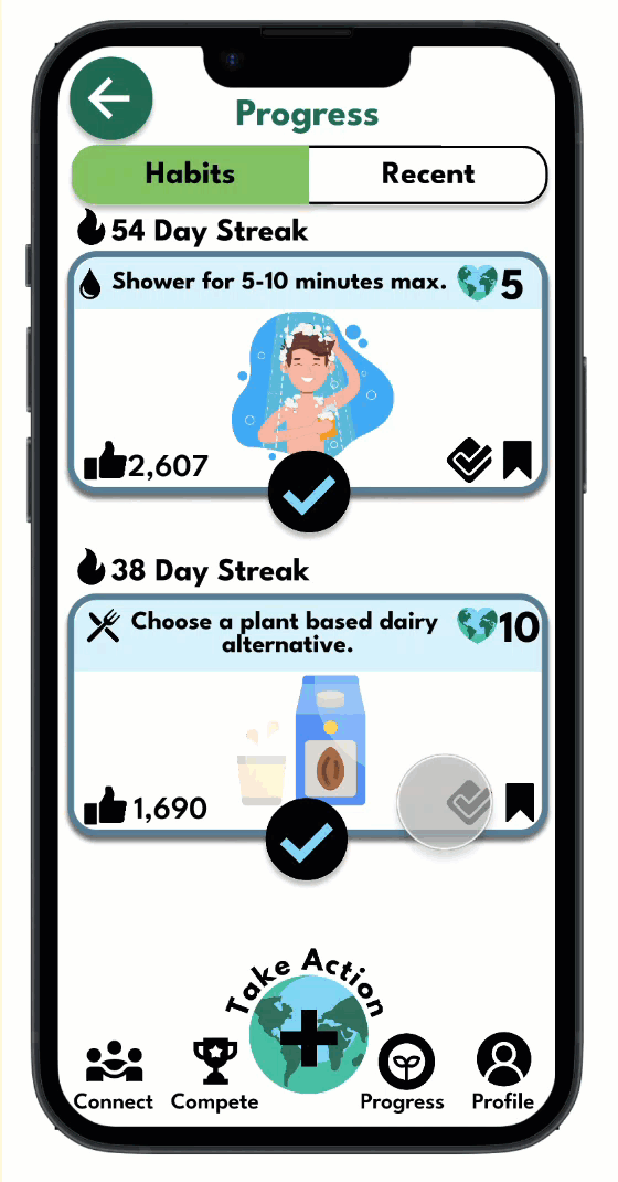
Progress indicator to show users their habits and recently completed tasks.
An intuitive profile section that allows users to edit their account and request help.
bottom of page