top of page


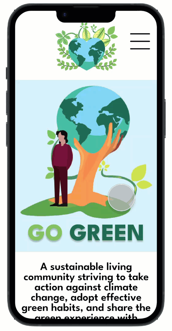
A responsive website designed for the Go Green sustainable living app to inform users of the app's mission and help them take action against climate change, adopt effective green habits, and share their experience with friends.
My Role
Sole UX Designer
Duration
January 16th-26th, 2023
Design Software
Figma
Overview
The Go Green website was part of my third project in the Google UX Design Professional Certificate Program. I created the responsive website for the Go Green sustainable living app to provide users with an informative and effective way to learn about the app’s mission and take action against climate change by completing daily sustainable tasks.
The Problem
People are eager to take action against climate change but aren't sure how. They need a practical and affordable way to incorporate sustainable habits into their day-to-day lives.
The Goal
Design a sustainable living website that encourages people to take action against climate change by adopting practical and affordable green habits. In order to meet this goal, I followed the design process shown below.
The Design Process

Ideate
Prototype
Test

Define
Empathize
*Note: My design decisions for the Go Green responsive website are based on insights gathered during the empathize and define phases of the Go Green app design process. For the website, I went directly into the ideation phase. The UX design process is definitely not linear!
Ideate
In the ideation phase, I explored design solutions to the problems identified in the define phase of the Go Green app. After exploring solutions, I decided which to pursue as prototypes. During the ideation phase, I brainstormed with crazy eights, outlined the information architecture, created low-fidelity wireframes & prototypes, then transitioned into mockups and high-fidelity prototypes.
Crazy Eights
In order to get ideas flowing, I used the Crazy Eights design ideation exercise I learned from the Google UX Design Professional Certificate. The point of this exercise was to draw any solution that comes to mind in 8 minutes. This exercise was a fun, creative way for me to think outside of the box and generate lots of unique solutions.
.jpg)
Information Architecture
After generating ideas using the crazy eights exercise, I outlined the information architecture of my website. Outlining the information architecture ensured the information presented on my website was clearly organized so users have an efficient and enjoyable experience.

Low-Fidelity Wireframes
After creating the user flow, I drew low fidelity wireframes. I first wrote down a list of elements I needed for each screen, then created 4 different versions for each one. After drawing 4 versions of each screen, I put a star next to my favorite elements to narrow down which ones I’d include in the final version. I then combined these elements into refined wireframes and built them digitally using Figma.


Low-Fidelity Prototypes
Once my low-fidelity wireframes were completed, I created low-fidelity prototypes.

Mockups
After creating the low-fidelity designs, I transitioned to mockups. I also created a style guide to maintain consistency throughout my website.

High-Fidelity Prototypes
Once the mockups were complete, I created high-fidelity prototypes.

Prototype & Test
In the prototyping and testing phases, I tested my high-fidelity prototypes and refined them based on strong insights. During these phases I conducted a usability study, made insights from observations, and iterated on my designs.
Usability Study
After creating mockups and high-fidelity prototypes, I planned a usability study. I ensured 7 key elements were included in my research plan: the project background, research goals, research questions, KPI’s, methodology, participants, and a script. You can view my research plan here. I then conducted a moderated usability study with 5 participants. I recorded participants' click paths, notable observations, quotes, and rated their task completion. Below are results from one participant, you can view all 5 here.

Insights
-
Following the usability study, I organized my data using an affinity diagram.
.jpg)

-
Based on common themes throughout the usability study, I found four actionable insights:
Users need a larger font size for the navigation bar to increase usability.
Users need a way to navigate back to the sustainability categories page.
Users need a more intuitive download page.
Iterations
-
Based on the second insight, I increased the font size of the navigation bar to ensure usability.
-
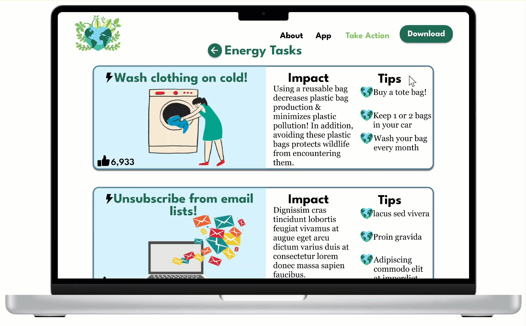
Based on the second insight, I added a back button to the "Energy Tasks" page so users can effectively navigate to other categories.
-
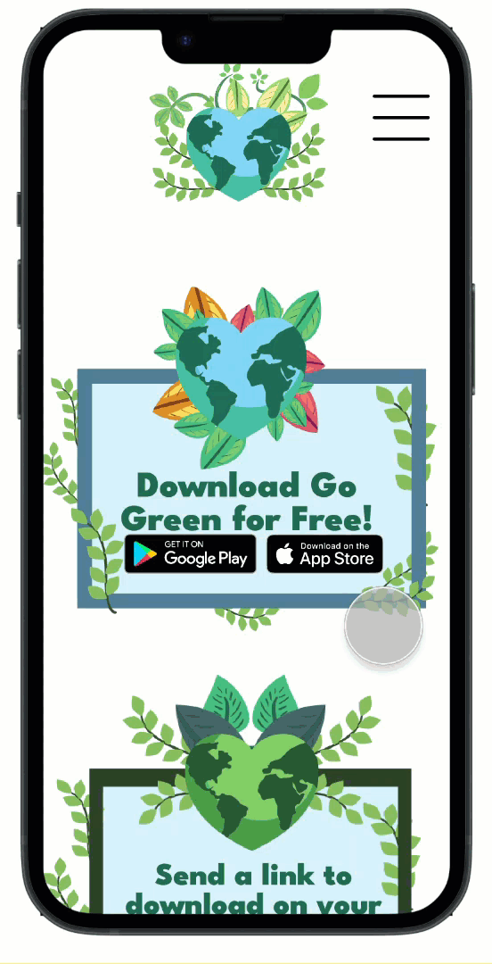
Based on the third insight, I added a way for users to send a download link to their mobile devices.
Before Iterations

Navigation text is too small and hard to click.
After Iterations

Enlarged text for easy and usable navigation.
Before Iterations

No way for users to return to the sustainability categories page.
After Iterations

A back button added to ensure users are able access all pages.
Before Iterations

Download options are only compatible with mobile devices.
After Iterations

A way for users to send a download link to mobile devices.
The Final Design
After ensuring my design was usable, equitable, enjoyable, useful, and fulfilled the intended user experience, I decided it was finished. See the website's key features below.
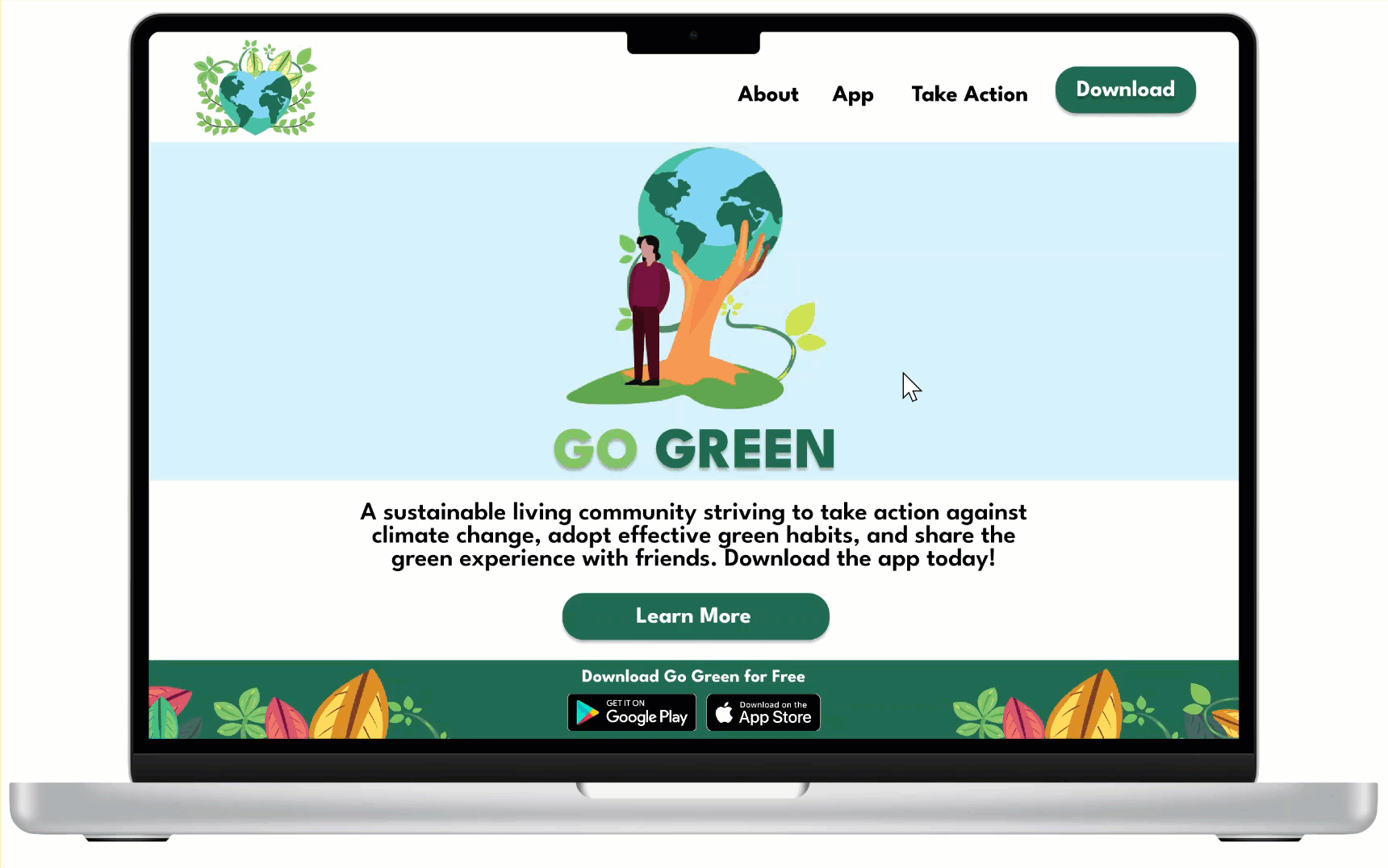

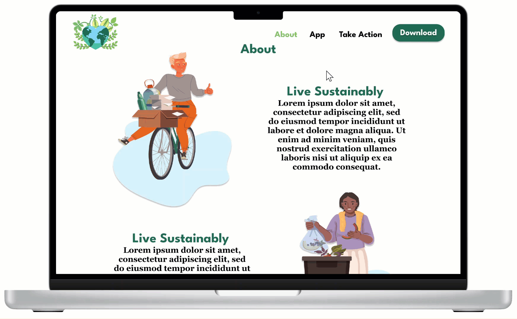
A beautiful landing page connected to an informative and helpful about page.
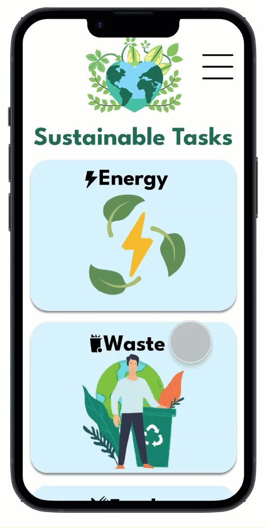
A descriptive app page that displays the Go Green app features and benefits.
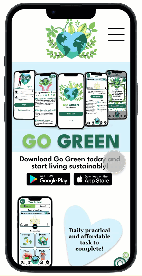
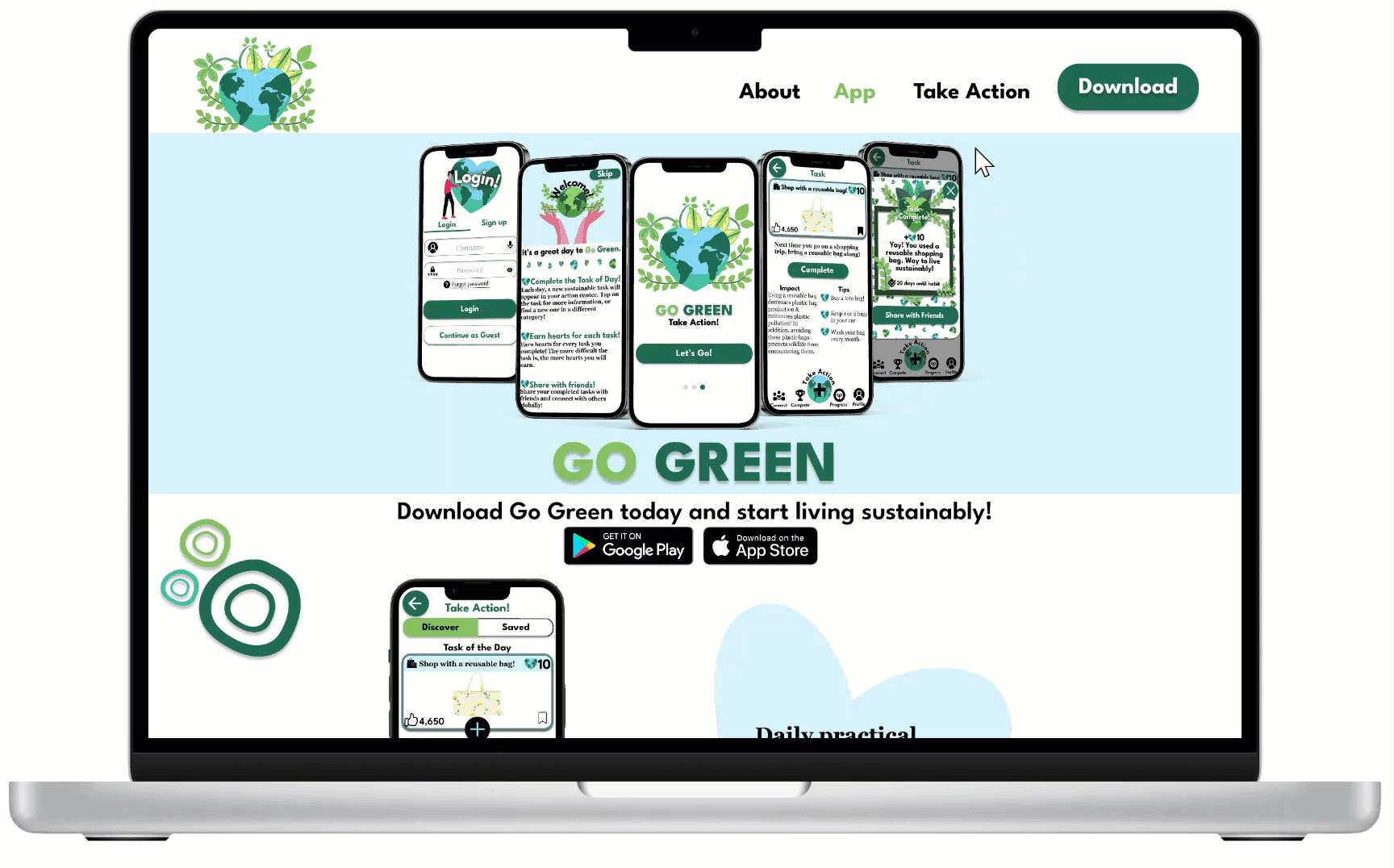
An engaging action page that resembles the Go Green mobile app.
An efficient way for users to download the Go Green app on any device.
Reflection
What I Learned
Creating the Go Green website taught me the importance of recruiting the right participants for specific projects. For this project, a majority of the participants I interviewed were fellow students and friends. While I still gained valuable feedback and insights, I realized that in order to gather strong user research, I need to interview a larger array of users with various backgrounds and perspectives. Moving forward, I plan on gathering a more diverse group of participants to create the best user experience for all.
Next Steps
-
More Testing: As previously mentioned, I need to ensure that the group of participants I interview consists of users from differing backgrounds and abilities. That being said, I plan on conducting a second usability study with a new set of participants to further validate the user experience of the Go Green website.
bottom of page